English | MP4 | AVC 1280×720 | AAC 48KHz 2ch | 1h 21m | 251 MB
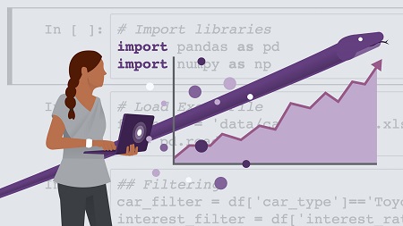
Data visualization is incredibly important for data scientists, as it helps them communicate their insights to nontechnical peers. But you don’t need to be a design pro. Python is a popular, easy-to-use programming language that offers a number of libraries specifically built for data visualization. In this course from the experts at Madecraft, you can learn how to build accurate, engaging, and easy-to-generate charts and graphs using Python. Explore the pandas and Matplotlib libraries, and then discover how to load and clean data sets and create simple and advanced plots, including heatmaps, histograms, and subplots. Instructor Michael Galarnyk provides all the instruction you need to create professional data visualizations through programming.
Topics include:
- Basics operations in pandas
- Loading data
- Slicing and filtering data
- Identifying and replacing missing data
- Converting and exporting pandas DataFrames
- Creating plots with Matplotlib
- Using Matplotlib wrappers like Seaborn
- Creating heatmaps, histograms, and subplots
Table of Contents
1 Effectively present data with Python
2 What you should know before you start
3 Using the exercise files
4 Value of data visualization
5 Why use a programming language
6 Overview of Jupyter Notebooks
7 Introduction to pandas
8 Create sample data
9 Load sample data
10 Basic operations
11 Slicing
12 Filtering
13 Renaming and deleting columns
14 Aggregate functions
15 Identifying missing data
16 Removing or filling in missing data
17 Convert pandas DataFrames to NumPy arrays or dictionaries
18 Export pandas DataFrames to CSV and Excel files
19 Basics of Matplotlib
20 Setting marker type and colors
21 MATLAB-style vs. object syntax
22 Setting titles, labels, and limits
23 Grids
24 Legends
25 Saving plots to files
26 Matplotlib wrappers (pandas and Seaborn)
27 Heatmaps
28 Histograms
29 Subplots
30 Next steps
Resolve the captcha to access the links!